Configuring StreamUP Test Card
by Andi
Version: 0.0.1
Turn any source into a labelled test card. Colour bars, an alignment grid, a solid colour, or your own image, with a bit of text on top so you know what you're looking at.
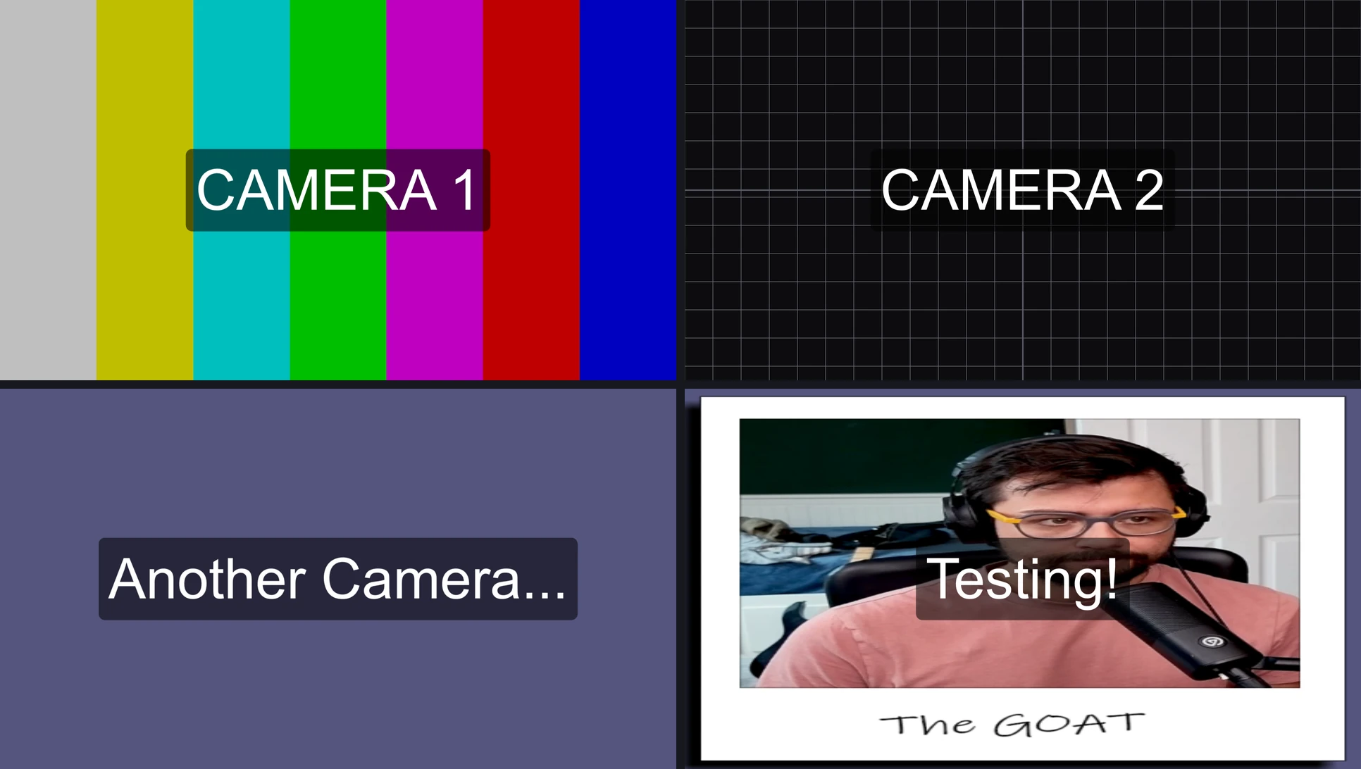
It's built for placeholder inputs. Say you're building an overlay on a machine that hasn't got the real capture cards plugged in yet. Drop a Colour Source in, add this filter, label it CAMERA 1, and you've got something to frame and rehearse against. Add a few more and you can build the whole multi-cam layout before a single camera is connected.
There's a shader version of this that runs on Exeldro's ShaderFilter plugin. This is the native one. Same idea, but you get real typed text in any font and a settings panel that only shows the controls that matter for the background you picked.
Requires OBS 31.1 or newer. Works on Windows, macOS and Linux.
Adding the Filter
- Add a Colour Source to your scene (or use any full-frame source you like)
- Right-click it, choose Filters
- Under Effect Filters, press + and pick StreamUP Test Card
The card takes over the whole source straight away. Everything below is just tuning it.
Background
The first choice, and it changes the rest of the panel. Pick the look you want and only the relevant controls show up underneath.
Colour Bars
SMPTE-style colour bars, the classic seven-bar chart. White, yellow, cyan, green, magenta, red, blue, left to right.
- Bars Brightness sets the level.
0.75is the broadcast-standard 75% bars. Push it to1.0for full-intensity bars if you want them brighter.
Grid + Crosshair
An alignment grid with a crosshair through the centre. Good for lining up overlays, checking your safe areas, or just having something with structure to frame against.
- Grid Line Colour is the colour of the lines and the crosshair.
- Grid Spacing is the gap between lines in pixels.
- Grid Line Width is how thick the lines are.
- Crosshair Width is the thickness of the centre cross. Set it to
0if you don't want the crosshair.
Solid Colour
One flat colour. That's it. Set it with the Solid / Backdrop Colour picker.
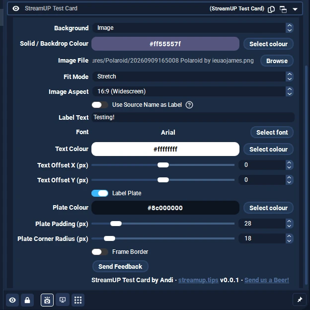
Image
Your own PNG or JPG instead of a generated pattern.
- Image File is the file to show.
- Fit Mode is how it maps to the frame. Stretch fills the frame and ignores aspect. Fit shows the whole image and letterboxes it. Fill covers the frame and crops the overflow.
- Image Aspect is the width-to-height ratio of your image. Fit and Fill use it so the picture isn't squished. Stretch ignores it.
The Solid / Backdrop Colour also doubles as the backdrop behind the grid and the letterbox colour behind a fitted image.
Label
The text on the card. This is the bit the shader version can't really do, so it's worth a look.
Use Source Name as Label
Turn this on and the card labels itself with the name of the source the filter is on. Rename the source to CAMERA 2 and the card follows. Turn it off if you'd rather type your own.
Label Text
Whatever you want on the card. CAMERA 1, NO SIGNAL, OFFLINE, the name of a feed, anything. Real typed text, so you're not stuck picking from a list.
Font
The standard OBS font picker. Whatever you've got installed is fair game, at whatever size you like. The size here is what drives how big the label is.
Text Colour
The colour of the characters. White over the plate is the usual, but it's yours to change.
Text Offset X / Text Offset Y
Nudge the label off centre. Positive X moves it right, positive Y moves it down. Handy if the middle of the frame is where your actual content sits and you want the label out of the way.
Label Plate
A filled panel behind the text so it stays readable over busy colour bars. On by default.
- Label Plate turns it on or off.
- Plate Colour is the panel colour. The alpha controls how see-through it is, so you can have it sit softly over the background rather than a hard block.
- Plate Padding is the gap between the text and the edge of the plate.
- Plate Corner Radius rounds the corners off.
Frame Border
A border round the edge of the card. Off by default.
- Frame Border turns it on.
- Border Colour and Border Width are exactly what they sound like.
Good to Know
- The panel adapts to the background. Grid controls only appear when you're on the grid, image controls only appear on Image, and the bars brightness only shows for colour bars. You're not hunting through settings that don't apply to what you're building.
- It replaces whatever you put it on. The card fully covers the source, so a plain Colour Source is the easiest thing to drop it on. You don't need the source underneath to be anything in particular.
- Real text beats a preset word. The shader version builds its label from a dropdown word and a number, because shaders can't read typed text. This one takes anything you type, in any font, which is the main reason to reach for it.
- Auto-labelling from the source name. Handy for a rack of dummy cameras. Name the sources CAMERA 1, CAMERA 2, CAMERA 3, turn on Use Source Name, and each card labels itself.
A Few Ideas
If you're stuck for where this is useful, here's the sort of thing people do with it.
- Dummy cameras for building a multi-cam layout before the real captures are plugged in. Four Colour Sources, this filter on each, labelled CAMERA 1 to 4.
- Placeholder feeds while you design an overlay for a client or a friend on a machine that hasn't got their hardware.
- A NO SIGNAL or OFFLINE card to sit behind a capture source, so if the input drops you get a clean labelled card instead of a black hole.
- An alignment grid for lining up lower-thirds, logos and safe areas while you build a scene.
- Colour bars for checking a capture chain or setting up a monitor.
The point is you've always got a clean, labelled placeholder to build against, whether or not the real thing is connected yet.